
The Dance of Details: How Efficient Visual Communication and Personalized Design Adjustments Elevate User Experiences
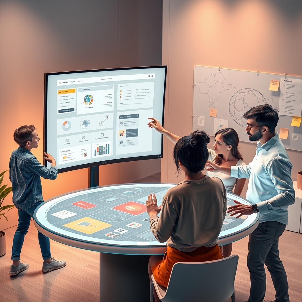
In the ever-evolving landscape of digital design, the smallest details often hold the power to transform a mundane interaction into a memorable experience. The magic lies not just in creating something that looks good, but in crafting interfaces that feel inherently right—where every button, color, and transition serves a purpose. This is where the principles of efficient visual communication and personalized design adjustments come into play, acting as the unsung heroes of user-centered design optimization. They are the threads that weave together functionality and emotion, ensuring that users don’t just navigate a product but connect with it on a deeper level.
The Language of Visuals: Speaking Without Words
Visual communication is the silent ambassador of your digital product. It transcends language barriers, cultural differences, and even technical literacy, conveying meaning in an instant. Think of the universally recognized symbols for play, pause, or save—these icons don’t need labels because their design speaks for itself. But efficient visual communication goes beyond icons. It encompasses typography, color psychology, spacing, and even micro-interactions that guide users intuitively through their journey.
For instance, the use of color can evoke emotions and influence behavior. A call-to-action button in a vibrant hue like orange or red can create a sense of urgency, while softer tones like blues and greens can instill trust and calm. Similarly, typography isn’t just about readability; it’s about personality. A sleek, modern sans-serif font might convey innovation and efficiency, while a serif font could evoke tradition and reliability. The key is to align these visual elements with the brand’s identity and the user’s expectations, creating a cohesive and immersive experience.
The Role of Micro-Interactions in User Engagement
Micro-interactions are the tiny, often overlooked details that make a digital experience feel alive. They are the subtle animations that occur when a user likes a post, the haptic feedback from a button press, or the progress bar that fills up as a file uploads. These interactions may seem insignificant, but they play a crucial role in seamless user experience enhancement. They provide feedback, acknowledge user actions, and make the interface feel responsive and dynamic.
Consider the simple act of refreshing a webpage. A static page might leave users wondering if their action was registered, but a smooth pull-to-refresh animation reassures them that the system is working. These small moments of delight can significantly enhance user satisfaction and engagement, turning a functional interface into an enjoyable one. The challenge for designers is to ensure that these interactions are not just decorative but purposeful, adding value without overwhelming the user.
Personalization: The Art of Feeling Understood
In a world where users are bombarded with generic content, personalization is the secret sauce that makes a digital experience stand out. It’s about moving beyond the one-size-fits-all approach and tailoring interactions to individual preferences, behaviors, and needs. Personalized design adjustments can range from simple customizations, like allowing users to choose their theme or layout, to more complex adaptations, such as recommending content based on past behavior.
Take streaming platforms like Netflix or Spotify, for example. Their success isn’t just in the vast libraries they offer but in how they curate content for each user. By analyzing viewing or listening habits, these platforms create personalized recommendations that feel almost psychic in their accuracy. This level of personalization doesn’t just improve user satisfaction—it fosters loyalty and long-term engagement. The underlying principle is simple: when users feel understood, they are more likely to return.
Data as the Compass for Personalization
Personalization isn’t guesswork; it’s a data-driven process. Data-informed design upgrades allow designers to make informed decisions about how to tailor experiences. By analyzing user behavior, such as click patterns, time spent on pages, or navigation paths, designers can identify pain points and opportunities for improvement. Heatmaps, A/B testing, and user feedback are invaluable tools in this process, providing insights that guide iterative interface improvement.
For instance, if data shows that users frequently abandon their shopping carts at the payment stage, designers might simplify the checkout process or offer multiple payment options. Similarly, if a particular feature is underutilized, designers can experiment with its placement, visibility, or even its design to make it more appealing. The goal is to create an experience that feels bespoke, where every interaction is optimized for the individual user.
The Intersection of Aesthetics and Usability
While personalization and visual communication are powerful tools, they must be balanced with usability. This is where aesthetic usability optimization comes into play. A beautiful design is meaningless if users can’t navigate it, and a highly functional interface can feel sterile if it lacks visual appeal. The sweet spot lies in creating designs that are both intuitive and visually engaging, where form and function coexist harmoniously.
Consider Apple’s design philosophy, which prioritizes simplicity and elegance. Their products are not just aesthetically pleasing; they are designed to be intuitive, with every element serving a clear purpose. This approach reduces cognitive load, making it easier for users to focus on what matters most. The lesson here is that aesthetics should never come at the expense of usability. Instead, they should enhance it, creating a seamless and enjoyable experience.
Accessibility: Designing for All
No discussion of user-centered design would be complete without addressing accessibility. Accessibility-focused improvement ensures that digital products are usable by everyone, regardless of their abilities. This includes designing for users with visual, auditory, motor, or cognitive impairments, as well as those using assistive technologies like screen readers or voice commands.
Accessibility isn’t just a moral imperative; it’s a legal and business one. Inclusive design expands your audience, improves SEO, and enhances the overall user experience. Simple adjustments, like ensuring sufficient color contrast, providing alternative text for images, or enabling keyboard navigation, can make a world of difference. Moreover, accessible design often benefits all users, not just those with disabilities. For example, captions on videos are useful for people in noisy environments, and larger text sizes can help users with temporary vision impairments.
The Future of Design: Adaptive and Scalable Solutions
As technology continues to evolve, so too must our approach to design. Adaptive design solutions and scalable design systems are becoming increasingly important in creating products that can grow and change with user needs. An adaptive design adjusts to different devices, screen sizes, and user contexts, ensuring a consistent experience across platforms. Meanwhile, scalable design systems provide a framework for consistency, allowing designers to maintain coherence as a product expands.
For example, a design system might include reusable components like buttons, forms, and navigation bars, along with guidelines for their use. This not only streamlines the design process but also ensures that the user experience remains cohesive, even as new features are added. The result is a product that feels familiar and intuitive, no matter how much it evolves.
Design is not a static discipline; it’s a living, breathing process that requires constant iteration and refinement. The most successful digital products are those that embrace this mindset, using behavioral design insights and performance-driven design changes to create experiences that resonate with users. Whether it’s through the subtle language of visuals, the power of personalization, or the inclusivity of accessible design, every detail matters. The goal is not just to meet user expectations but to exceed them, crafting experiences that feel effortless, engaging, and deeply human. In this dance of details, the smallest steps often lead to the most profound connections.